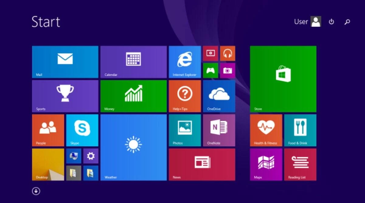
The worst version of Windows, as argued by many, is Windows 8. While it may not have been the buggiest release, it is widely considered one of the most pointless ones. This controversial operating system was released in 2012 during a time when the iPhone 5 was all the rage, "Call Me Maybe" was the most overplayed song, and the end of the world that people were bracing for didn't happen.
Windows 7 had been out for about three years and was well-received by users, but it was designed for traditional desktops and laptops. With the impending shift towards mobile computing on touchscreen devices, Microsoft didn't want to be left behind, so they decided that Windows should be on everything from desktop PCs to smartphones. In 2010, Microsoft released Windows Phone 7, an operating system for phones that introduced the concept of live tiles.
The live tiles were meant to distinguish Windows Phone 7 from iOS and Android. Instead of static app icons, users would get large tiles that showed real-time information like messages, emails, and news updates. This design language, called Metro, was actually well-received, with some outlets praising Microsoft for going in such a different direction.
Windows 8 directly borrowed many design elements from Windows Phone 7, likely due to positive feedback or because Microsoft planned for that to happen all along. However, this move was not well-received by users. Microsoft thought that having Windows look the same on every device was the correct way to get it onto every device, but it turned out that this was not the solution.
One of the biggest aspects of Windows that Microsoft had emphasized since Windows 95 was multitasking. With Windows 8, this simple and long-standing design convention was upended by the much-maligned start screen. Instead of the familiar start menu, users got a start screen with a dizzying mosaic of live tiles that often spit out useless information and steering users towards full-screen Metro apps. This made multitasking much more confusing, as the Metro app took over the whole screen and the taskbar would disappear, leaving novice users wondering what was going on.
Additionally, Windows 8 lacked any option to restore the classic start menu, a decision that was so unpopular that developing third-party tools to restore it became a cottage industry. The built-in app store, while not bad, raised concerns about Windows becoming a walled garden in which users would have less control over their own PCs.
Although Windows 8 was roughly as stable and polished as Windows 7, some of the weird UI decisions could have been forgiven if Windows 8 actually improved in other ways. For desktop users, there were some useful new features, such as the ribbon in File Explorer, a new task manager with a performance monitor, secure boot to prevent against rootkits, and native USB 3 and NVMe support. However, these features likely could have been part of a Windows 7 update and did not necessitate such a radical redesign of the user interface. Simply put, Windows 8 did not give users enough positive changes to outweigh the negative ones, especially considering that Windows 7 was a popular minimalist, unintrusive operating system that largely stayed out of the way.


No comments yet