Almost everyone understands the principles of a color wheel: primary colors, secondary colors, and how certain combinations of colors work. Despite this, learning how to combine and mingle red, yellow, blue, orange, purple and green is not all that there is to the color wheel. Our color knowledge is enhanced by knowing the different color schemes. Artists and designers, for example, need this. Color schemes are broken down below by artist Patti Mollica. Using an excerpt from her book, How to Paint Fast Loose and Bold, she also shows the impact of different color schemes on the same composition. You'll love it!
Harmonic Color Schemes
Although it is fun to play around with colour schemes by picking colours at random based on our personal preferences, there are some colour combinations, referred to as harmonic colour schemes, that are thought to be particularly attractive. A harmonious colour scheme consists of two or more colours that, according to their positions and distances from one another on the colour wheel, have a particular relationship. It helps if you are familiar with some of the most often used colour phrases before we go over the fundamentals:
- Tint: White added to lighten a colour.
- Hue: Paint's unmixed color out of the tube.
- The addition of grey to a color lightens or darkens it.
- Shade: The addition of black to a colour to darken it.
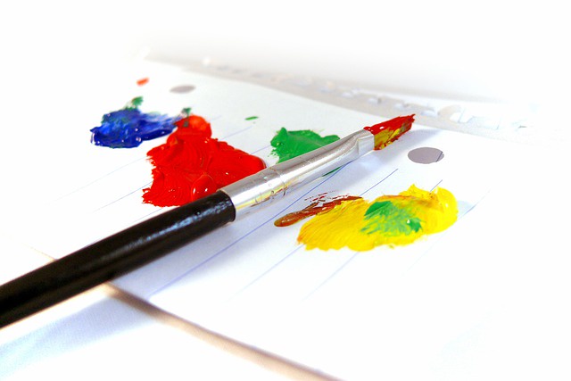
Utilizing each hue's full spectrum should be a consideration while creating colour schemes. This covers all of its tones, tints, and shades. It will provide the eye with some tranquil colours that have been neutralised, brightened, or darkened. These variations additionally enable the sparing use of the more potent saturated hues for emphasis when required.
Make some quick colour sketches if you want to work with the colours of your choosing but are unsure of where to begin. Go to the hardware shop and purchase some colour chips or swatches in the shades you wish to use if you need colour inspiration. It helps to see the colours collectively. Additionally, you can quickly alter your palette to your liking by including and excluding colours. Once you've chosen your colour scheme, combine and blend those hues to get new shades, such as lovely unified greys and other related variations. Let's now discuss the different colour schemes.
Create a Color Scheme
Let's investigate how a colour scheme is made.
-
Begin with a picture as a guide
For a more dynamic composition, use a reference image as a starting point when working on the general design of the picture. A strong underlying design is a good painting's most crucial component. Bypassing this step will result in you merely duplicating what is in front of you. And nature rarely provides the ideal composition for an effective painting. Mountains, trees, and anything else that weakens rather than strengthens your composition will frequently need to be moved.
-
Draw a three-value diagram.
Create a three-value sketch based on the image. Try making some changes that you think would improve the composition. In this instance, I wanted the barn to stand out more. So I made it bigger and added a silo. I turned the hill's horizontal angle into a diagonal one. In this manner, the focal point, the barn, is brought directly into focus for the observer.
Because I thought the tree on the left would give an intriguing silhouette shape against the sky, I reduced the height of the hill. Because it divided the foreground into two identical regions, the foreground's greenery strip felt obtrusive. To add a more interesting angle to an otherwise extremely horizontal design, I changed it into a diagonal dark patch.
-
Select a colour scheme with primary and secondary colours.
Pick a couple colour schemes to test out after you are satisfied with the value sketch. The colour schemes I employed are listed to the left, clockwise:
- Analogous: Blues and greens
- Complementary: Greens and reds
- Triad: Primary colours — yellow, red, and blue
- Analogous Complementary: Yellows and oranges, blues and violets
It is best to select one colour to be the dominant one and employ the other colours as subordinates when dealing with colour schemes, whether they are based on personal preference or any of the traditional schemes from the relationships on the colour wheel. In other words, using colours in different amounts makes them more fascinating. For instance, it is preferable to use either red or green as the dominating hue rather than both colours in equal amounts when employing the complementary colours red and green. As a result, the painting acquires a general atmosphere and vibe. Hope this article is helpful, If you are a miniature artist, a lamp with a magnifying glass will help you better see your miniature art.

No comments yet