One of the first things you should know about trading is how to read charts! This is something essential to learn since charts are ALWAYS used when trading. This is what helps traders identify price movements, trends and patterns in the market to help make better speculations and overall better trading decisions.
Whether you’re trading through a broker like MetaTrader 4, peer-to-peer or many more, charts are something you’ll be seeing a lot of. But before you start learning about how to read charts, you should first know the common types of charts used in trade. We’ve listed down the 5 commonly used charts you’ll surely stumble upon during your trading journey!
So without further ado, here is a rundown of the main charts used in trade:
1 - Line chart
This is probably the most popular and used chart among the rest! The line chart is a beginner-friendly chart used to identify trends over time. These are also commonly used for long-term analysis. So if you are a day trader, this chart might be one you won’t use often.
The e-chart, also called a "line chart," can illustrate trends using a set of data points joined by straight lines accounting for its simplicity. Each of these points represents the asset's closing price over a specified time, providing a clear picture of how the asset's worth changes over time.
A fundamental tool for traders, analysts, and investors alike, the e-chart offers insightful information about market movements. It facilitates decision-making whether following stock prices, commodity values, or any other financial asset.
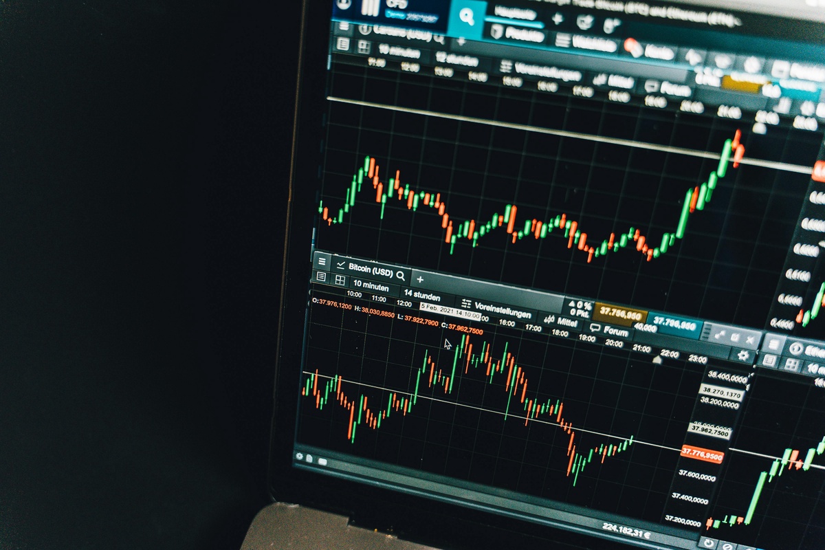
2 - Candlestick chart
Candlestick charts, which are well-known for their thorough depiction of price fluctuations, provide an in-depth analysis of market activity over a certain time. These charts carefully display an asset's opening and closing prices as well as its peak and lowest values across the observation period. The structure of each candlestick, which is the foundation of technical analysis in the financial markets, contains important information.
A candlestick's body, which represents the range of prices among the opening and closing prices, is located in its centre. To visually signal whether the closing price is higher or lower than the starting price, this body is usually filled or coloured differently.
The "wicks" or "shadows," which stretch above and below this body, surround it. These lines show the whole range of price activity by noting the highest and lowest prices obtained within the timeframe, which gives important context.
3 - Bar chart
Bar charts are a reliable alternative to candlestick charts since they provide a different but no less informative view of market dynamics. These charts provide traders and analysts with a thorough perspective of price activity by painstakingly presenting the open, high, low, and closing values within a specific timeframe, just like their candlestick counterparts do.
The use of bars to depict pricing data, as the name implies, is what differentiates bar charts. Vertical lines that stretch from the top and bottom of each bar in this graphic representation represent the greatest and lowest prices attained during the time under consideration. The starting and closing prices are indicated by horizontal lines, and their relative positions offer important clues about the mood and movement of the market.
4 - Heikin-Ashi chart
Heikin-Ashi charts are a type of candlestick chart that uses modified candlesticks to provide a clearer picture of price patterns and to filter out market noise. The open, high, low, and close values of these charts are calculated by averaging the values of the previous candlesticks. This novel method improves clarity and helps traders identify significant patterns in the face of market volatility.
5 - OHLC chart (Open-High-Low-Close)
The opening, highest, lowest, and closing values within a given timeframe are displayed in OHLC (Open, High, Low, Close) charts, which provide a succinct summary of price changes. OHLC charts are fundamentally similar to candlestick charts, however they might not have the same complex visual clues. Even yet, they continue to be very useful tools for traders, offering crucial information for assessing price movement and reaching wise judgements in the volatile world of financial markets.
Take away
Now you know some of the most common charts used in trade, you can now start learning how to read them. With a gist of what they are and how they work, you’ll be able to learn how to read these babies in no time! So before wagering into any trade, you should first educate yourself with charts!

No comments yet