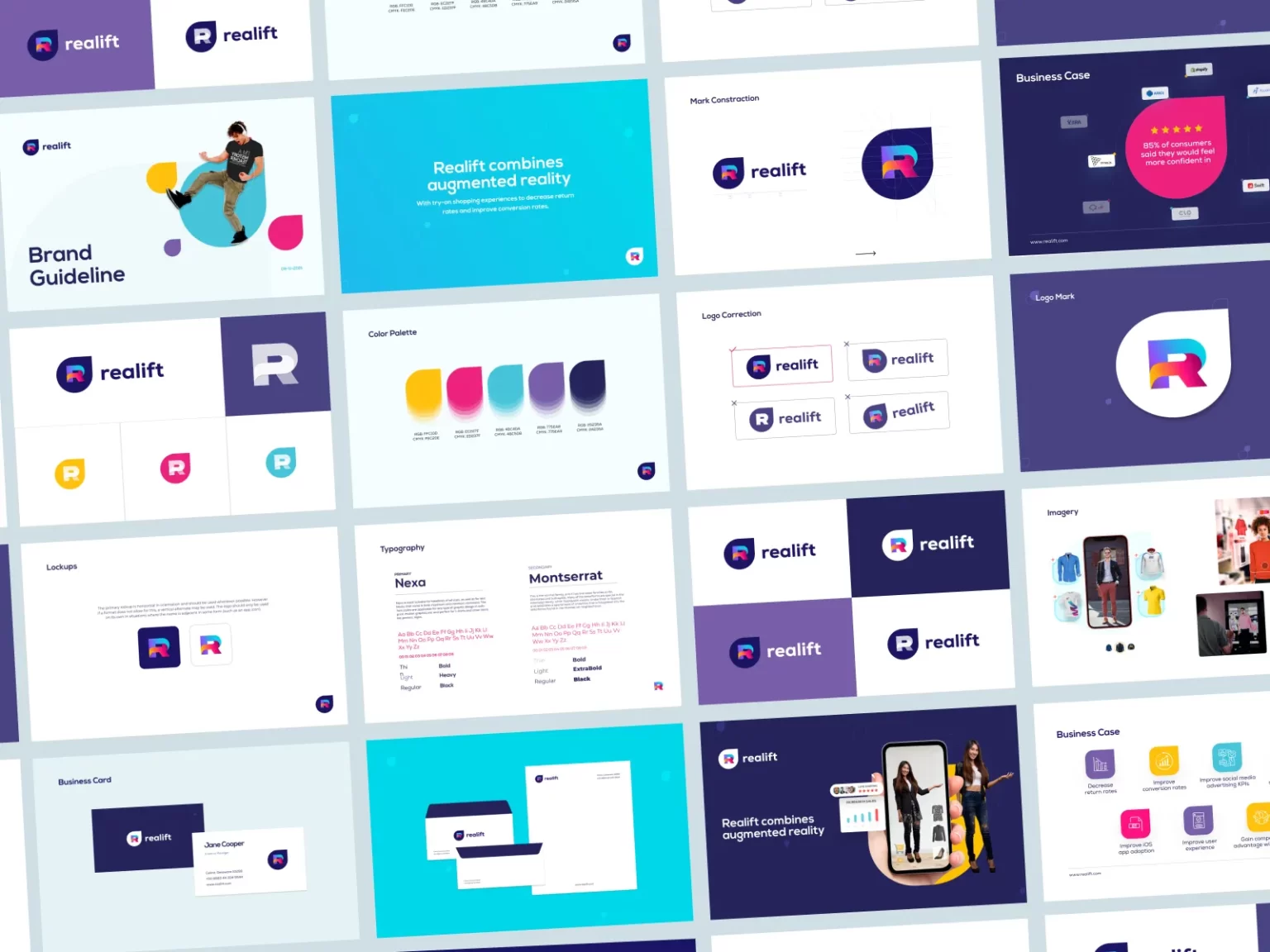
In digital design, the interplay of color, composition, and contrast serves as the cornerstone upon which compelling visuals are crafted. As the digital landscape evolves, the need for visually striking graphics has become more pronounced than ever. The utilization of these fundamental design elements can significantly elevate the appeal and effectiveness of your creative endeavors.
The Significance of Color
Color is a powerful tool in the hands of a skilled designer. It transcends mere aesthetics, diving deep into the realm of psychology and perception. Understanding color theory is paramount in the pursuit of creating impactful graphics.
The choice of color palette can set the tone and mood of your design. Warm colors like reds and yellows evoke energy and passion, while cool blues and greens elicit calmness and tranquility. Utilizing complementary colors can create striking contrast, making elements stand out with magnetic allure.
However, restraint is key. A myriad of hues can be overwhelming, diminishing the clarity of your message. It's essential to maintain a balanced color scheme, employing the 60-30-10 rule: 60% of the dominant color, 30% of a secondary color, and 10% of an accent color. This harmonious distribution ensures visual coherence and prevents chaos.
Mastering Composition
The art of composition is akin to arranging the elements of a symphony. It guides the viewer's eye, dictates the flow of information, and shapes the overall impact of your graphic.
One of the fundamental techniques is the rule of thirds. Imagine a grid divided into nine equal parts with two horizontal and two vertical lines. The intersections of these lines are prime focal points. Placing your key elements at these intersections can create a balanced and visually pleasing composition.
Moreover, the concept of visual hierarchy is pivotal. By employing size, color, and contrast, you can prioritize information within your design. The most crucial elements should be the most prominent, guiding the viewer's attention precisely where you want it.
Employing negative space strategically is equally crucial. Blank areas within your composition can enhance the visibility of your content, allowing it to breathe and communicate more effectively. It's a tool often overlooked but never to be underestimated.
The Role of Contrast
Contrast is the spark that ignites the visual experience. It is the interplay between light and dark, bold and subtle, that adds depth and dynamism to your graphics.
One form of contrast is tonal contrast, which relates to the variation in brightness and darkness of different elements. Utilizing dark text on a light background or vice versa ensures readability and clarity. Furthermore, varying the contrast can draw attention to specific elements, emphasizing their significance.
Color contrast is equally vital. Pairing complementary or contrasting colors can make certain elements pop, while monochromatic schemes can evoke elegance and sophistication. Be mindful of color accessibility standards, ensuring that your design is inclusive and perceivable by all.
The Marriage of Elements
To create impactful graphics, it's essential to understand that color, composition, and contrast are not isolated entities but interconnected facets of design.
Imagine designing a logo for a digital agency offering unlimited design services. The choice of color palette should reflect the agency's brand identity and values. A composition that highlights the agency's core offerings while maintaining a visual hierarchy can effectively communicate their value proposition. And, judicious use of contrast can draw attention to the agency's name or slogan, leaving a lasting impression on the viewer.
In conclusion, crafting impactful graphics is an art form that demands a deep understanding of color, composition, and contrast. These design elements are not to be taken lightly, as they wield the power to convey emotions, deliver messages, and leave indelible imprints on the minds of viewers.
As the digital landscape continues to evolve, the importance of mastering these elements becomes increasingly evident. Whether you are designing for a digital agency or any other endeavor, embracing the synergy of color, composition, and contrast will undoubtedly unlock a world of creative possibilities, ensuring that your visuals resonate with your audience and leave a lasting impact.


No comments yet