Tracing Amazon’s Iconic Logo
From its modest beginnings in Jeff Bezos’ garage to its current status as the world’s second-largest company, Amazon’s ascent is a defining tale of the Information Age. A parallel narrative unfolds in the evolution of the Amazon logo, serving as a visual chronicle of its remarkable journey.
Ultimately, it crystallizes into the iconic Amazon Smile we recognize today. In the realm of renowned brands, Amazon stands tall. Let’s embark on the Amazon logo story, exploring its history, symbolism, and significance.
Along the way, we’ll offer insights for crafting your own iconic logo design, a specialty of Logo Magicians, a leading logo design agency based in the USA, known for their exceptional logo design services and custom logo designs tailored to the unique identities of businesses across the nation.
Amazon’s early beginnings
Long before Jeff Bezos shot himself into space wearing a cowboy hat and proclaimed it the ‘Best Day Ever,’ he was just a guy with a dream in a garage in Seattle (you can find the actual house Amazon was started in here).
In 1994, foreseeing internet’s retail potential, Bezos left his hedge fund job for Seattle. He launched an online bookstore, quickly outpacing traditional rivals.
Fun fact: Amazon was first incorporated as Cadabra Inc, until a lawyer misheard the name as ‘Cadaver’ (lol). Bezoz was not keen to be known as a company that sells dead bodies. So, he changed the name to Amazon, after the Amazon River, the largest river in the world. (Which is probably full of dead bodies, ironically).
The ‘Amazon’ name became pivotal in shaping the iconic ‘Smile’ logo, featuring an arrow from A to Z, symbolizing the endless range of products and comprehensive delivery.
The evolution of the Amazon logo
Amazon’s logo has undergone several redesigns throughout its history. These logo redesigns reflect the company’s evolution.
Here’s a quick overview of the major logo redesigns in Amazon’s history. We’ll also review how other branding elements evolved as the company has changed.
Amazon’s original logo (1995–1997)
The original Amazon logo was designed by the agency Turner Duckworth, in 1995. (The same agency would go on to design today’s logo, too.)
Amazon’s original logo, though dated, embodies timeless design concepts. Its enduring elements
The original Amazon logo, featuring the full website name and a nod to the Amazon River in the A, laid the groundwork for the current modern, lowercase wordmark. Despite its early clunkiness, it remains effective and recognizable, showcasing the evolution of design concepts.
Zebra print logo (1997–1998)
The first Amazon logo redesign in 1998, reminiscent of late 90s styling, introduced a distracting zebra print effect, overshadowing the original monogram’s visual impact. Fortunately, this short-lived design was in use for only a year.
Amazon’s 1998 logos
In 1998, Amazon experimented with three logos, each a step in evolving its brand identity. While the initial attempts had shortcomings, the final ’98 logo laid the groundwork with a bold sans-serif font and the iconic orange line, foreshadowing the current Amazon logo
The Smile logo (2000 — present)
Amazon’s breakthrough logo was developed in 2000 by the design agency Turner Duckworth (check out the famous case study for Amazon’s logo).
The final 2000 Amazon logo integrated previous elements. The orange smile, an evolution of the curvy line, became iconic. The streamlined Officina sans bold font and removal of the full website name enhanced the modern look. The smile, now synonymous with Amazon, features prominently on the company’s packaging.
Amazon logo’s symbolism and meaning
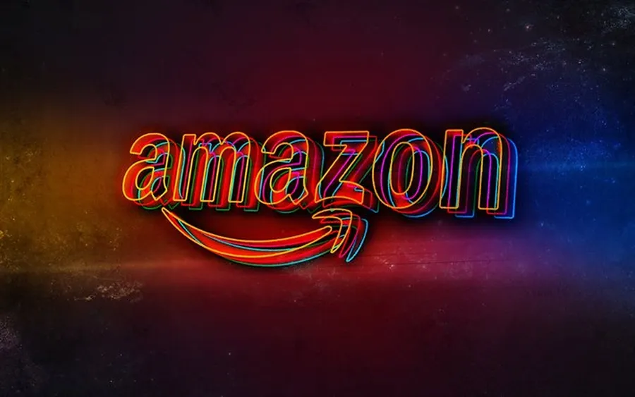
Amazon’s 2023 logo: Simple, clever, and iconic. The arrow from A to Z forms a smile, symbolizing satisfaction and endless service.
Amazon’s logo evolution reflects a shift from river symbolism to a cleaner, product-centric design. It mirrors the company’s global growth and focus on seamless experiences and customer satisfaction
The impact of the Amazon logo
The Amazon logo profoundly shapes the brand, embodying simplicity and core values. It evolves, capturing commitment to exceptional experiences and extensive product delivery.
Turner Duckworth has demonstrated a consistent approach to logo design across Amazon’s many subsidiaries. Maintaining a sense of visual cohesion while allowing room for unique elements that help differentiate each unit.
Let’s take a look at some additional logos of the Amazon brand.
AWS
The AWS logo works in the signature curved arrow from the main Amazon logo, emphasizing the connection and integration between the two entities.
Amazon prime
The company’s subscription service for shipping and streaming retains the core elements of the primary Amazon logo with significant changes. Primarily, the replacement of Amazon with the word “Prime” and the distinctive Prime blue color. The smile icon remains, showing us how powerful it is as a brand symbol.
Amazon ads
An example of one of the simpler subsidiary logo executions, the Amazon ads logo features the original logo with the word ‘ads’ shortly after in a lighter-weight font.
Amazon music
Another example of a simpler logo addition, Amazon music follows the previous pattern but includes a unique font color for the lighter weight font style.
Amazon studios
The Amazon Studios logo is the most noticeable deviation from the original logo. It has a more cinematic design through a white logo font on a black background and all-caps text.
Conclusion
the evolution of the Amazon logo exemplifies the power of a symbol in shaping brand identity. Through thoughtful redesigns, Amazon transitioned from river themes to a cleaner, product-centric design, symbolizing global growth and a focus on exceptional customer experiences.
Much like the iconic Amazon logo, businesses can benefit from professional logo design services, particularly those offered in the USA. Just as Amazon’s logo became synonymous with its core values, a well-crafted logo from expert logo design services in the USA can convey a brand’s essence and values effectively.
Just as the Amazon logo stands as a visual testament to the company’s commitment, businesses can leverage classic sonic logos, similar to Amazon’s journey, to create a lasting and impactful visual representation of their brand identity.

No comments yet