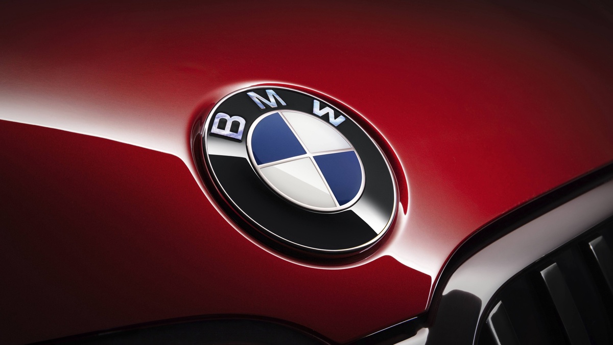
BMW Logo’s Story of Symbolism
How acquainted are you with the BMW logo? Chances are, you’ve encountered this iconic emblem while cruising on the road or passing by a BMW showroom. Whether you’re a proud BMW owner or have noticed the logo on other vehicles, the origin and meaning of this symbol may remain a mystery.
In our exploration today, we’ll delve into the current state of the BMW logo, unravel its history, and uncover its intended symbolism. Discover the artistry behind this emblem, reflecting the excellence of professional logo design in the USA, with a touch of Dallas logo design finesse.
Our journey introduces you to the work of a logo design firm and the prowess of a professional logo designer, showcasing the evolution and significance of the BMW logo.
BMW Logo Evolution
Like other famous logos, the BMW logo has also changed over the years. Read on to learn about its versions and discover hidden things you didn’t know about the BMW logo.
1913–1917
Known as The Rapp Logo, the first logo of BMW represented the company as an aircraft engine maker. It featured a silhouette horse in the center of a circular frame, which depicts speed. A thick black frame also houses the name, two stars, and eight curved lines in white colors.
Instead of the business name BMW, you can see the wordmark Rapp Motor in bold letters.
1917–1933
The company introduced its first colored logo design. The new logo featured four quadrants that looked like an aircraft propeller in two white and two blue colors in the middle of a thick black frame. Retaining the wordmark design, it changed from Rapp Motor to a golden BMW and two thin gold outlines.
Tip: If you want your brand to come off as vibrant, friendly, and fun, use colorful logos.
1933–1953
BMW had its first redesign in 1933, but it’s just a minor update. The colors of the four quadrants stayed the same. However, the inner and outer golden circle frames became thicker than the previous ones. Also, the wordmark BMW is now bolder, sharper, and sleeker.
1953–1963
In 1953, the major update focused on the color palette. From thick golden circular frames, you’ll now see thin silver outlines. The golden BMW lettermark is now gray, and the iconic blue and white colors inside the circular shape frame are now lighter. The update in the colors made the black ring more visible.
1963–1997
The 1963 update uses contrasting color effects — black, white, and blue. Can you spot the difference between this version and the previous one?
The circular frames and the BMW wordmark are now in color white font on a black circular ring. The blue and white quarters are enhanced to look intense.
Among the previous updates, this version is clean, attractive, and represents authority. If you want your brand to give off that vibe, use black and white logos.
1997–2020
Looking powerful, distinct, and modernized, the 1997 BMW logo perfectly reflects the beginning of the tech era! With its 3D appearance, the logo featured a white wordmark on a broad circular background with silver-gray outlines. Due to the black lines dividing the quadrants from both ends, the inner blue and white colors became apparent.
2020-Present
After three years, the brand bid goodbye to the iconic 3D logo design for 2D. The designer replaced the dominant black frame with a thick white frame. The brand’s name and the outlines shifted to gray. Plus, the dividing lines between the quadrants are now invisible.
This logo version looks clean, calm, and assertive and follows a minimalist design.
Conclusion
Few companies require an introduction, and BMW is undoubtedly one of them. With a steadfast commitment to quality and a dedication to maintaining a cohesive brand image, BMW has carved a distinguished reputation over the years.
Today, the BMW logo stands as a symbol of quality and style for countless car owners. As we conclude, it exemplifies the impact of expert logo design, underscoring the significance of professional logo design companies and the value of top-tier logo design services, particularly in the USA.


No comments yet