The Evolution of Sony’s Iconic Logo
In the realm of logo design services, the evolution of the SONY logo serves as a testament to the importance of adaptability and innovation in branding strategies. Much like superhero logos, which undergo revisions to resonate with contemporary audiences, the SONY logo has continuously evolved to reflect the company’s evolving identity and global aspirations.
A key figure in the development of the logo was Sony designer Yasuo Kuroki, who dedicated significant effort to its evolution. In 1961, Sony made a pioneering move by placing the new logo on a neon sign in a prestigious area of Hong Kong, marking the company as the first Japanese entity to do so in the region.
However, adjustments were necessary to adapt the logo for this display method. Kuroki, then working in the Publicity Department, was tasked by Morita to craft a suitable design. The following year, Kuroki’s logo proudly featured in advertisements for Sony’s miniature televisions.
In 1981, amidst the dawn of a technological revolution with the release of the Walkman just 18 months prior, Sony recognized the need for a logo redesign. Departing from the traditional approach, Sony didn’t assign a design team for the task. Instead, it initiated the “Sony International Logotype Design Contest,” attracting nearly 30,000 submissions globally.
A rigorous selection process ensued, with a committee meticulously reviewing each entry and shortlisting 59 finalists. These designs were then presented to the board of directors, executives, designers, and sales managers for evaluation. However, during this review process, Sony seemingly realized a significant oversight.
In the realm of custom logo design and logo design companies, Sony’s approach showcased a unique blend of innovation and community engagement, underscoring the significance of public participation in shaping corporate identity.
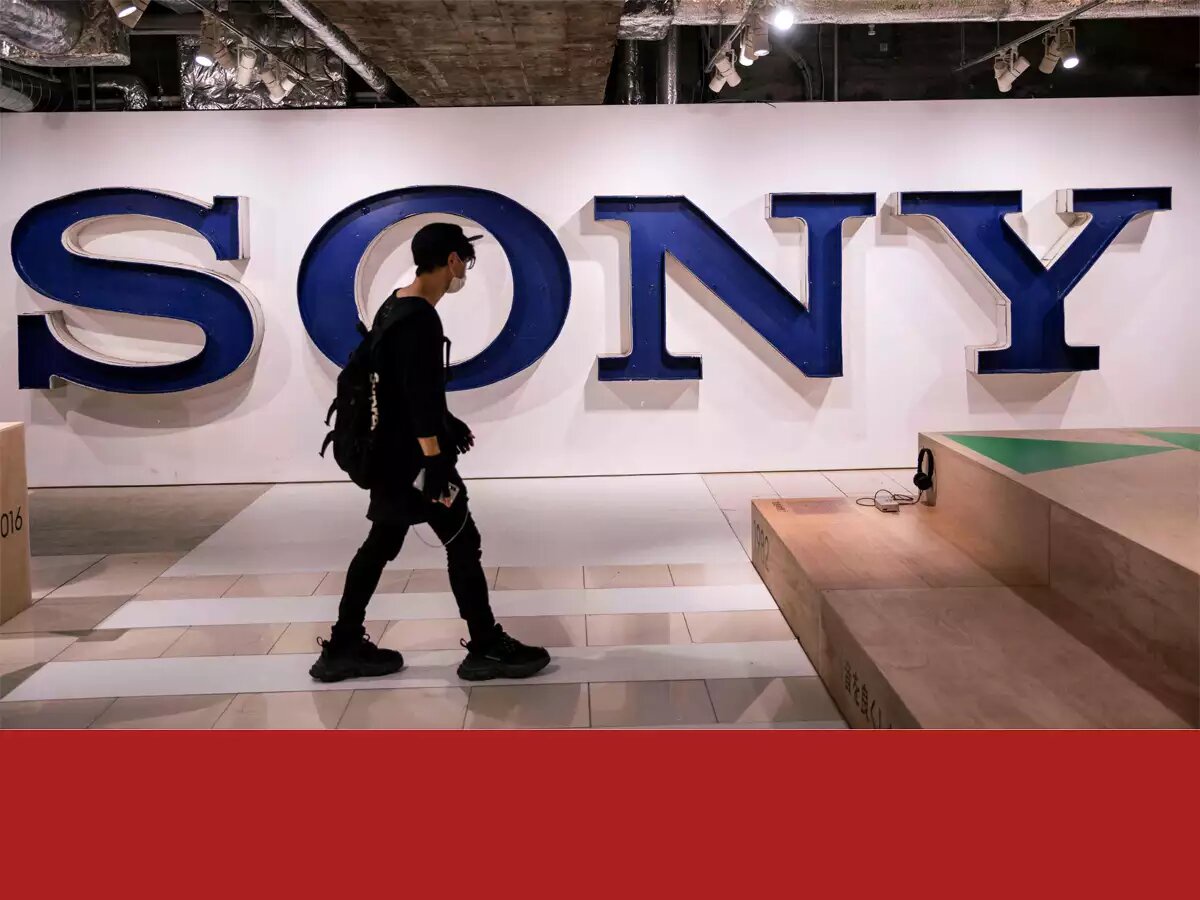
The History Of The Sony Logo
Brand loyalty in electronics is built through timeless logo design, as demonstrated by Sony, a reputable company with over 75 years of experience. The universal logo created by Sony has generated brand loyalty and made it the leading technology company globally. This recognition of Sony’s unique logo design has made it a trusted choice for consumers.
Meet Sony
Sony, founded in 1946 in Tokyo, is a leading electronics consumer brand that produces computers, video games, accessories, and robots. It also operates as an entertainment company with a record label and production company. Sony’s philosophy is to create and deliver products and services that contribute to society’s betterment. The brand is the world’s largest music entertainment company, gaming console company, and gaming publishing company.
The Evolution of Sony
Above, we provided you with a brief introduction to the Sony brand but in this next section, we’ll take you on a deeper dive into Sony’s evolution.
The early days of Sony (1946)
Sony, founded in 1946 by Akio Morita and Masaru Ibuku in Tokyo, quickly launched its first product, a megaphone, in 1950. The company registered its logo as an official trademark, promoting the brand on a larger scale.
Sony Expands Overseas (1960)
Sony, founded by Akio Morita, expanded internationally after recognizing the rise in portable transistor radio purchases in the US. Launched in 1960, the company became a leading exporter, introducing key products like the CD and establishing a Sony life insurance company.
Sony Navigates a Recession (1980s)
In the 1980s, the electronics industry faced a global recession, leading Sony to lower product prices and lower sales. Norio Ohga expanded Sony’s global reach by purchasing CBS Records and Columbia Pictures.
Sony’s Continued Growth
Since the 1980s, Sony was no stranger to innovation. Sony released new gaming consoles, like the PlayStation, and continued to grow its non-electronics divisions. Sony is known today as an innovative company and since first expanding overseas, Sony has remained a highly sought-after company across the globe.
Challenges that Sony Has Overcome
Sony, a technology leader, faced pushback to update its logo for 50 years, especially for its 35th anniversary in 1981. Despite reviewing global design submissions, none were chosen. Sony also faced competition in the saturated electronics industry, but despite these challenges, the company remained a leader in the technology space.
The Sony’s Logo Evolution
Sony’s logo evolution, influenced by the brand’s transition from analog to digital, has been a consistent reflection of this evolution, with Yasuo Kuroki being a key designer and contributor.
The First Version (1946–1955)
The first logo iteration of the Sony brand, introduced after its official launch, featured a simple abstract figure in bold black, resembling a trapezoid.
The Second Version (1955–1957)
The logo version for Sony, featuring a contemporary, stylistic design with a handwritten script and a wordmark, was registered as a trademark in 1955, a few years after the first iteration.
The Third Version (1957–1961)
Sony underwent a bolder redesign three years later, featuring a rounded, serif font with capital letters. The design was exaggerated to emphasize the wordmark. Sony also rolled out its logo internationally, first in Hong Kong, using neon colors on billboards.
The Fourth Version (1961–1962)
The fourth logo design, lasting a year, featured minimal updates and experimented with letter shapes, elongation, and space incorporation.
The Fifth Version (1962–1969)
In 1962, Sony’s fifth logo update featured a sharper design, straightened wordmark, and monochromatic color palette, retaining its timeless elegance and belonging to the company.
The Sixth Version (1969–1973)
In 1969, a new logo design with elongated letters and rounded corners was created, combining previous designs to convey the brand’s confidence and professionalism.
The Seventh and Current Version (1973 — Today)
The Sony logo design, first introduced in 1973, has been a remarkable feat of maintaining a consistent design for 50 years. This modern update, created by a committee within Norio Ohga’s Design Division, features a straight, horizontal line.
The Sony Logo’s Font, Color and Symbol
The Font
At first glance, you may mistake Sony’s logo for the font, Clarendon, but Sony’s logo is its own unique font. This original font is used beyond the logo, for Sony’s slogan as well.. “make-believe”
The Color
Sony’s logo doesn’t use any flashy colors, instead sticking to a monochromatic color palette of black and white. These colors make the logo appear bold and powerful. These color choices also help the logo convey perfection, elegance, sharpness, and integrity.
The Symbol
Sony’s unique logo symbol is its wordmark, symbolizing simplicity, strength, and innovation. Initially testing an emblem-like trapezoid, it didn’t tie back to the brand. The wordmark’s unique design remains a unique symbol for Sony.
Sony Today
Sony, a global leader in the technology industry, has been an early innovator and adapter. The company’s current CEO is Kenichiro Yoshida, with Howard Stringer serving as the first non-Japan native CEO. Stringer made strategic decisions, including reimagining media operations and updating the company’s slogan, “Make Believe.”
Kazuo Hirai became CEO in 2012, aiming to unite worldwide subsidiaries under “One Sony.” With over 109,700 employees and $80 billion in 2022 revenue, Sony ranks 116 among Fortune 500 global companies.
Lessons Learned from Sony
Sony’s logo evolution teaches us that trusting a simple, timeless design is key to building brand loyalty. It’s not about updating or adding features, but rather sticking with the design. To replicate Sony’s strategy, consider a simple, timeless design. Companies like Logo Magicians can help with this, ensuring a logo that stands the test of time.
FAQs
What is Sony’s mission?
Sony’s mission is to create and deliver products and services that contribute to the betterment of society. This philosophy has remained consistent throughout the brand’s evolution.
What products does Sony offer?
Sony is a leading electronics consumer brand, offering a wide range of products including computers, video games, accessories, and robotics, which are distributed globally.
Is Sony only an electronics company?
No, Sony is also an entertainment company, competing in the music and film industries with its record label and production company operating under the Sony brand.
How has Sony evolved over the years?
Since its founding in 1946, Sony has expanded internationally, introduced innovative products like the Walkman and PlayStation, and diversified its business interests beyond electronics.
Why did Sony maintain its logo for 50 years?
Despite suggestions for redesigns, Sony stuck with its logo due to its perceived superiority and its alignment with the brand’s identity and values.
Conclusion
Sony, founded in 1946, is a global leader in electronics and entertainment, known for groundbreaking advancements like the Walkman and PlayStation. Its logo, evolving over time, represents its core values of simplicity, strength, and innovation, symbolizing its commitment to excellence and relevance in the ever-evolving consumer electronics landscape.
In an era where visual identity plays a crucial role in brand perception, Sony’s logo redesigns have underscored the importance of professional logo design services. Collaborating with top-tier logo design companies, Sony has leveraged expertise and creativity to refine its brand image, ensuring alignment with evolving market trends and consumer preferences. Through strategic logo redesigns, Sony has reinforced its position as a leading innovator in the industry.
As a prominent player in the United States market, Sony’s engagement with logo design USA reflects its commitment to capturing the hearts and minds of American consumers. Partnering with custom logo design USA specialists, Sony has tailored its visual identity to resonate with the diverse and discerning American audience, further solidifying its presence and influence in the region. By prioritizing localized logo design initiatives, Sony continues to strengthen its foothold in the US market, driving brand loyalty and engagement.

No comments yet