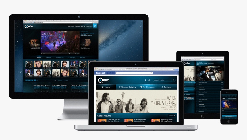
Responsive web design has become the standard in the digital world, allowing websites to adapt seamlessly to various screen sizes and devices. Ensuring a consistent and user-friendly experience across desktops, tablets, and smartphones is essential in today's online landscape. In this article, we'll explore the do's and don'ts of responsive web design, helping you create websites that shine on any screen.
What is Responsive Web Design?
Responsive web design (RWD) is an approach to web development that prioritizes flexibility and adaptability. It ensures that a website's layout, content, and functionality adjust automatically to provide an optimal user experience on different devices and screen sizes.
In responsive design, the website's layout is constructed using fluid grids, flexible images, and CSS media queries. These components work together to create a dynamic web experience that smoothly transitions from large desktop monitors to smaller smartphone screens.
The Do's of Responsive Web Design
- Prioritize Mobile-First Design: Start with mobile devices in mind. Designing for smaller screens forces you to focus on essential content and functionality, ensuring a streamlined user experience.
- Use Fluid Grids: Implement flexible, percentage-based grid layouts that adapt to different screen sizes. This approach enables your design to scale smoothly without breaking.
- Optimize Images: Compress and serve appropriately sized images to reduce the load times of pages on mobile devices. Consider using responsive image techniques to display different image sizes based on the user's device.
- Test Across Devices: Regularly test your website on various devices and browsers to identify and address any issues promptly. Embrace user testing to gain valuable insights into real-world usage.
- Content Prioritization: Determine which content is most important for each screen size. Place critical information at the forefront and hide less crucial elements on smaller screens.
- Implement CSS Media Queries: Use CSS media queries to apply specific styles based on screen size and device orientation. This technique ensures your design remains visually appealing and functional across the board.
The Don'ts of Responsive Web Design
- Avoid Fixed Widths: Steer clear of fixed-width layouts that don't adapt to different screens. Fixed layouts can lead to horizontal scrolling on smaller devices, frustrating users.
- Don't Overload with Features: Resist the temptation to cram every feature into the mobile version of your website. Focus on delivering a simplified experience that emphasizes essential actions.
- Say No to Flash: Flash content is outdated and unsupported on many mobile devices. Instead, use HTML5 and CSS3 for animations and interactive elements.
- Inadequate Testing: Skipping comprehensive testing across devices and browsers can lead to unforeseen issues. Neglecting this step can result in a poor user experience.
- Ignoring Performance: Neglecting performance optimization can lead to slow-loading websites, driving users away. Prioritize performance enhancements, like minifying CSS and JavaScript and leveraging browser caching.
- Unintuitive Navigation: Complex or non-intuitive navigation can frustrate users on small screens. Ensure that menus and navigation elements are easily accessible and user-friendly.
Conclusion
Responsive web design is not just a trend; it's a necessity in today's digital landscape. By adhering to the do's and avoiding don'ts of responsive web design, you can create websites that provide a seamless and enjoyable experience for users on all devices. Keep the user at the center of your design decisions, and your responsive website will shine, regardless of the screen it's viewed on.
However, if you want your website to shine with a responsive web design, then visit www.searchmarketingservice.com. We will help you in elevating your online presence in an exceptional way.

No comments yet