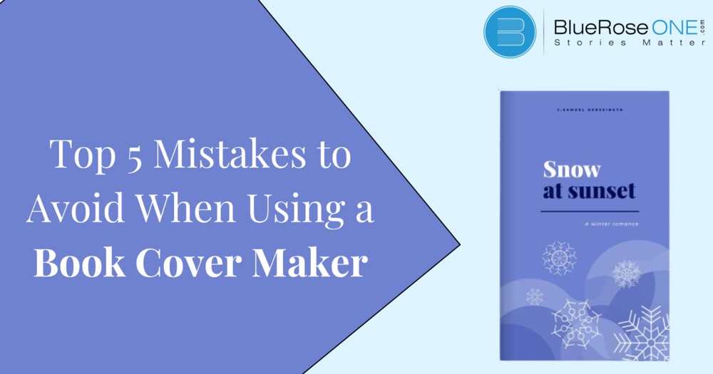
With the rise of self-publishing in the digital age, using book cover makers has grown in popularity. Though convenient, there are several typical faults in book covers that authors should avoid to make sure their work is properly represented and draws in readers.
Choosing the Wrong Template
Choosing the incorrect template is one of the most frequent errors made while utilizing a book cover maker. The entire look and feel of the cover design is influenced by the templates that form its base. Selecting a template that is at odds with the book’s category or tone will confuse prospective buyers and lessen the book’s appeal.
Authors should carefully assess the available templates and take into account elements like genre, target audience, and visual style in order to avoid making this error. It’s important to consider customisation possibilities to make sure the selected template may be adjusted to meet the book’s unique needs.
Ignoring Branding Guidelines
Another common error made by authors is to create their book covers without taking branding requirements into consideration. Maintaining consistency in branding cultivates a recognisable identity and encourages reader loyalty and trust. Branding principles should be followed to avoid a disconnected brand image and to protect the author’s credibility.
It is imperative for authors to guarantee that the color schemes, fonts, and artwork used on their book covers are consistent with their overall brand identity. By ensuring uniformity in all promotional materials, writers may bolster their brand awareness and leave a lasting impact on readers.
Overcrowding the Design
In book cover design, packing the layout with too many elements is a common mistake. Although it could be tempting to pack as much information as you can into a design, cluttered designs can overwhelm readers and take attention away from the book’s main point.
When designing their covers, authors should aim for clarity and simplicity, concentrating on the essential components that best express the spirit of the work. When it comes to drawing in readers and conveying the genre or concept of the book, minimalist designs frequently work better.
Ignoring Typography
Despite the fact that typography is vital to a book cover’s impact, writers frequently ignore it. Bad font selections can take away from the overall aesthetic and make the cover hard to read, which can lead to missed opportunities to draw in readers.
When creating book covers, authors should give great thought to typography, choosing typefaces that both fit the topic and improve readability. Finding the ideal ratio of intelligibility to aesthetics can be achieved by experimenting with various font sizes, styles, and layouts...Continue reading

No comments yet