One of the key elements of every website is its navigation. Website navigation can make or break your site. It is a crucial factor that directly affects your site's usability. When done well, it enables visitors to intuitively explore, interact, and easily locate what they need. A good menu makes it simple for users and improves their experience. However if it is poorly designed, it can be frustrating and drive users away. In this article, we will check out what you should and should not do when designing menus to help you create a user-friendly and efficient interface. We have collaborated with Reactive Graphics, a web design London based agency, to bring you these insights.
Tips for designing navigation menus
Maintain simplicity and clarity: Who doesn‘t love playing with innovative new design trends? But don’t over complicate your website by placing your menu bar in a random location. The main goal of a navigation menu is to help users easily find what they want. To do this, keep the menu simple and use clear and short labels for the items on the menu.
Prioritise content: Organise menu items by how important and relevant they are. The most vital parts should be at the very top because people usually look there first. Less important items can be placed towards the bottom or in sub-menus.
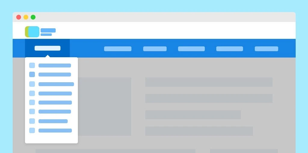
Limit the number of items: Like many things, start with the basics. Don't burden users with a super long list of menu choices. Studies suggest it is best to limit the number of items to seven. If you have more content to display consider using sub-menus or grouping related items together under a broader category.
Responsive design: Make sure your menu works on all kinds of screens and devices – mobile, desktop, laptop, etc. Use a mobile-friendly menu that adapts to smaller screens, such as a hamburger menu or a collapsible sidebar.
Provide feedback: When a user moves their mouse over or clicks on a menu item, show them a clear visual sign to let them know they did something. This can be changing the colour, highlighting the item or showing more choices.
Use recognisable icons: Icons can make your menu look better and easier to understand. But only use icons that everyone knows and also put text labels next to them so people don't get confused.
Include a search bar: Along with the main menu, include a search bar. It helps users find exactly what they want, especially on big websites with lots of content.
Make it easy to get Home: Finally, your visitors should be able to tell where they are on your website at all times and be able to navigate back to their starting point. Ensure there are links to Home throughout the website.
Mistakes in designing navigation menus
Non-standard style: Even though a minimalistic design looks nice when you hide or make the navigation menu too hard to find, it can make things confusing for people. The goal is to help people find your content, not show them a new way to get around a website.
Don't use too many fonts or styles: To make a menu look good and easy to understand, it is important to keep the text style and fonts the same. Don't use too many different fonts, font sizes or text styles in the menu. It is better to use a consistent look.
Avoid too many fancy animations: Gentle movements can make the user experience better, but using too many animations in your menu can be annoying and make things difficult. Don't use too many or very slow transitions that slow down how you move around the menu.
Remember to consider accessibility: Make sure everyone, including people with disabilities, can use your menu. Use semantic HTML, provide text alternatives for images and icons and check that you can move through the menu using the keyboard.
Avoid vague labels: The text on the menu should tell you clearly and correctly what's inside. Don't use general words like Click here or Learn more. Be specific and use words that explain what's there so users know what to expect.
Don't use too many sub-menus: Sub-menus can help keep things organised but don't make the menu too complicated by having lots of levels. This can confuse people and make it harder to find their way around.
In conclusion, good website navigation is important for a good user experience. A good user experience will encourage more leads to make purchases and is also better for SEO. Bad website navigation is among the top factors that cause visitor frustration. By following our tips and tricks in our article you can create a navigation menu that enhances the user experience and helps users find the content or features they are looking for.

No comments yet