In recent years, user interactions have evolved so rapidly that designers can hardly keep track of them. This evolution allows mobile android app development company borrow interaction techniques from other industries. As radical technological changes take place in electronic devices, the interaction models used must change. The need for such an approach was first revealed after the mouse and keyboard were replaced by touchscreens (a clear and recent example is Apple 3D Touch). New ideas open up additional possibilities, but at the same time, their appearance is fraught with potential difficulties - be it completely new interaction models or slightly modified old ones, any new version of the device, configuration, pattern or gesture.

Sorting out the innovations, let alone designing them, takes a lot of work. Here are a few stereotypes to avoid when working on app design .
Users always need to create an account
In many cases, this is not necessary at all. It's easier for developers to deny people access until they are part of the user database. But from the user's point of view, this is not entirely correct. Why would someone subscribe without knowing why it is being done? The registration process requires both physical and mental effort. And the result should be worth it.
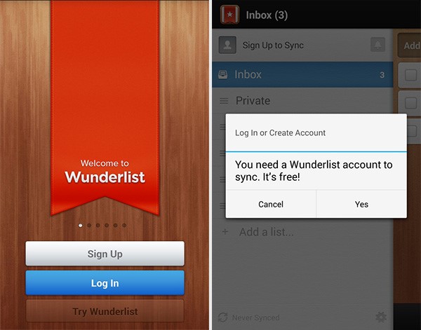
User data can be stored locally and subsequently sent to the account, but only when its owner sees fit. As an alternative to accounts, there can be a "guest" or "temporary" mode of access to basic features (as, for example, in the Wunderlist application), i.e. demonstrates the operation of the application, but with limited functionality.
As soon as you can assure the user that the application is worthy of attention, he will immediately register. But offering to subscribe right away may be premature.
Need a reference to explain the benefits of the app
It is more expedient to show in practice how good your development is. Allow you to try the app in action, instead of explaining its design with instructions that are often inconclusive. In addition, users tend to skip the so-called introductory course.
If you think step-by-step instructions are an absolute must (which is the case in some applications), then try to keep them as short as possible and add them to the help menu. It is much better to introduce users to the instructions after they have mastered the application a little.
What's right for one app doesn't always work for another
Even the most common patterns of interaction must be evaluated based on the specific features of the application. A typical example in this regard is the drop-down list of the address form and, in particular, the field "country". Since the names of some countries may be spelled differently, it would be logical to adhere to some standardization. For desktops, dropdowns are still okay, but when it comes to mobile usability, it's the worst choice.
Some modern applications have a number of truly memorable branded "moments". Twitter Bird, Animated Snapchat Profile or Hopper Loading Graphics.
In order to make an application noticeable against the background of its counterparts, it is not always necessary to adhere to some design conventions.
App design is like responsive web design
And while app design has a lot in common with responsive web design like Bookwriting Venture, there are also fundamental differences. Users expect to see a standard set of elements in the interfaces of mobile applications, and also that interactions will be built according to a certain pattern.
There are thousands of nuances, from menus and shapes to tooltips and font sizes. Elements of web design do not look quite appropriate and smooth in mobile applications - not because the developers miscalculated in something, it just looks different.
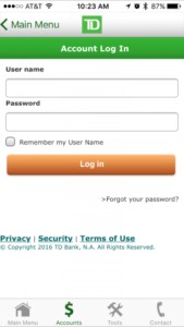
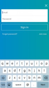
Login to iOS TD Bank and LinkedIn App
Let's compare how login is performed in two applications for the iOS platform: TD Bank and LinkedIn. In TD Bank, the basic user interface details are similar to those of a typical iOS application: the back button is on the left, the menu is at the bottom of the screen. The only omission of the developers is that they presented the login form (and other content on the page) in a style that is not typical for the application. Data entry lines have rounded edges and drop shadow effects that are standard for iOS applications, there is a tiny checkbox, underlined links. There is even a copyright mark in the UI. But this app still lacks something inherent in the app, which is noticeable in contrast to LinkedIn.
This development already leaves the feeling of an application. And it's not about the specifics of the design or some kind of interface element. LinkedIn developers did the design for the application, not just took the web code and wrapped it in the application.
Fidget spinners are a suitable loading indicator
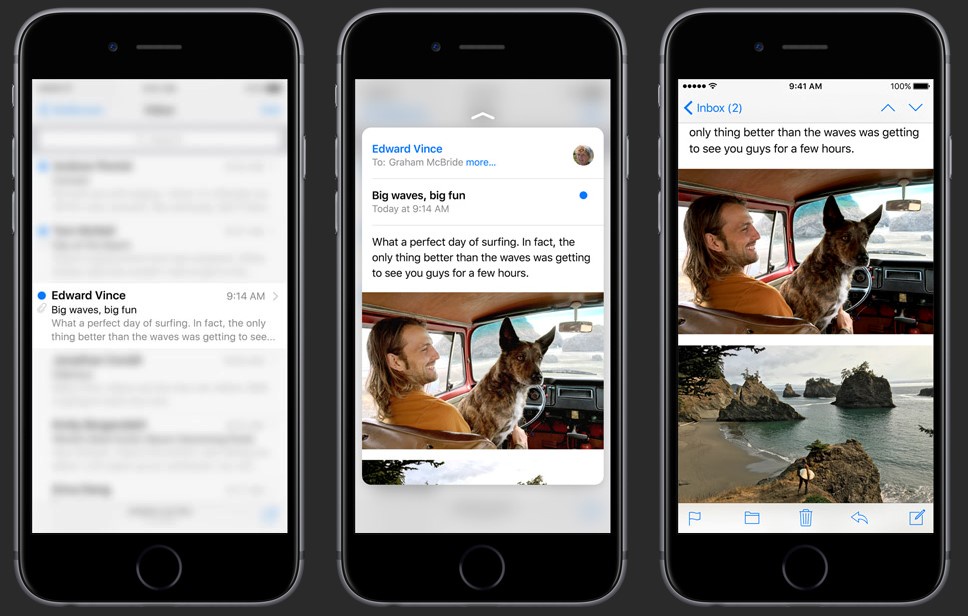
The default loading icons (for example, in iOS a rotating circle of gray stripes) may not be perceived as we would like. They are used for various functions of the operating system - they serve as status indicators for almost everything (from starting a device to problems with wi-fi or loading a slow application). Very often, spinners appear at the wrong time.
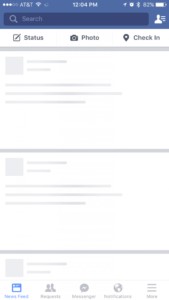
Therefore, many do not like it when only a rotating circle pops up on the screen and no more details - neither how much time has passed, nor how much is left. But you can make the download appear natural - or you can simply hide it. One way to hint that content is being prepared is with fill boxes, which are present in the Facebook app when the timeline loads. You can get creative with the choice of indicators, for example, add some fun element to the interface or brand logo.
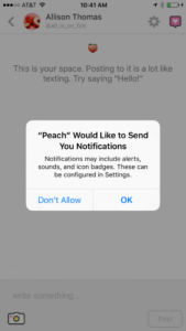
Users will allow notifications after first use
You should never rely on the "allow notifications" system dialog. This is something that designers often stumble upon. First, it's not clear why the app needs permission to distract the user's attention whenever it needs it. You can come up with some original pop-up window that says "allow notifications". Always educate users about the importance of your notifications (show by example if possible). Reassure them that you will not bombard them with spam or useless information.
Once users know how they benefit from notifications, show the system dialog - they will only see it once, so you need to do it right.
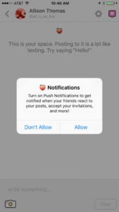
This approach is ideally implemented in the Peach application.
The first "Allow Notifications" dialog box looks like an iOS message (but it really isn't). It explains why notifications are needed, and users have no unnecessary doubts. And only after the person clicks on "allow", the iOS system window appears (by the way, not so informative).
Summary
Today, people expect a lot from application interfaces - the bar is constantly increasing. For companies whose business is built on mobile applications, the slightest flaws and mistakes can adversely affect the relationship with the user, so stereotypical approaches should be avoided.

No comments yet