When I first previewed the new features inside Android 11, I said that Android is a mature operating system. What that means is that unless some designer inside Google has a wild-eyed harebrained idea, things just aren't going to radically change that much in a mature OS. Instead, the updates are gonna be about cleaning up some bugs or fixing some security and privacy issues or adding new features.
But the thing about adding new features is that if you don't do it right, you end up just overwhelming the user. It all becomes this weird slurry of things that you just completely ignore. I mean, look at every single Samsung phone from like the Galaxy S3 to the Galaxy S8 if you want a good example of that. If you don't wanna bear your user in check boxes, what you have to do is manage complexity. And that is the real job of a mature operating system, managing complexity.
So for this review of Android 11, the big question is whether or not Google pulled that off. And my answer is barely, and I think I can explain why I point at this thing that a lot of us do when we get new software, it's the very first thing that I do after a big update, it's that I go to the settings. I poke around and see what's new inside the settings because often a lot of the new features, they're just sitting in there waiting to be toggled. It really is a pretty good way to learn what you can do in new software. It's like a site map, but for operating systems.
Let's talk about the new features in Android 11, but through the settings app.
The first setting I wanna look at is bubbles. So you got to Apps Notifications > Notifications > Bubbles, and you make sure it's turned on. But the thing to actually pay attention to is what happens when you get a notification from a chat app like Android Messages or Facebook Messenger or whatever. 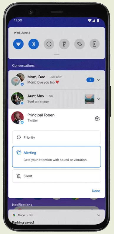 Firstly, they appear in the section at the top of your notifications called Conversations. And this section is awesome. It means that you don't miss chats in the mix of all of the other notifications you get from all those other apps you don't care about. And it also means you can do stuff like mute notifications on a given chat thread because it's really, really busy, but that doesn't mean you're gonna miss it even though it's muted 'cause it's still sitting at the top of your notifications. I really love it.
Anyway, bubbles, if you look at the notification, you're gonna see a little box in the lower right-hand corner of the notification. 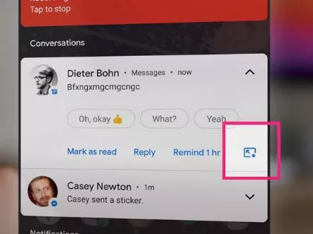 There's one version of it that has an arrow pointing to a circle, that's to turn bubbles on, or an arrow pointing away from a circle to the turn bubbles off. I think this icon is confusing and weird, but I guess the square represents a notification and the circle is a bubble. Anyway, you tap it to toggle bubble mode on or off for any given conversation.
When you bubble a conversation, it turns into this little circle that you could put anywhere on the screen, and then you tap on it. It opens up the chat thread and then you can chat. And you can intermix services. So you could have a stack of three or four or five different chat apps all in a single bubble, and tap and toggle between them. And this is great because it lets you have a conversation with somebody going for a while, really quick, while you're doing other stuff. And then you can just toss the thing away when you're done chatting with that person. Now, I know the first time you see bubbles, it's weird to have this thing pop up on your screen. You're probably gonna want to turn it off, but honestly, give 'em a shot. I ended up liking bubbles way more than I expected to.
As long as we're talking about the notification shade, there is another new thing up here. Your media controls are no longer interspersed throughout the top of your notifications. They're up there with your quick settings. That's just how it works now. But there is one setting that you can check. So you go to Sound > Media > Hide Player and you can turn this off. And I have it turned off. Disabling it means that your media controls will stick around for a while, even if you pause them.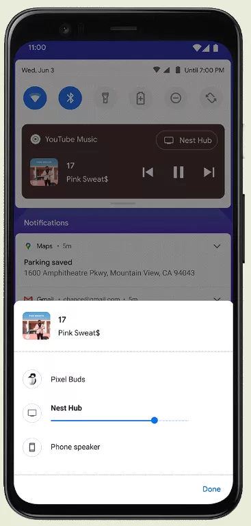 It creates some extra space in the shade, but it's worth it because then you can go there and play paused stuff more quickly. And the media player itself, it's the same buttons as before, but if you've played something from a few different apps, say Spotify and then YouTube and then Pocket Casts, instead of having all those stacked up in your notifications one after the other, now you swipe between them horizontally in this new section. And so that's really neat. Also, don't miss the output button inside this new media section, which lets you select where the audio is going. It would be pretty nice if this output things, some more things than, you know, just basically Bluetooth things, but maybe that's something for the next version of Android.
The next new big feature in Android 11 is Google's new Power Menu, which combines three kind of random things under a long press of the power button. So you've got Power controls, Google Pay, and then Smart Home controls. 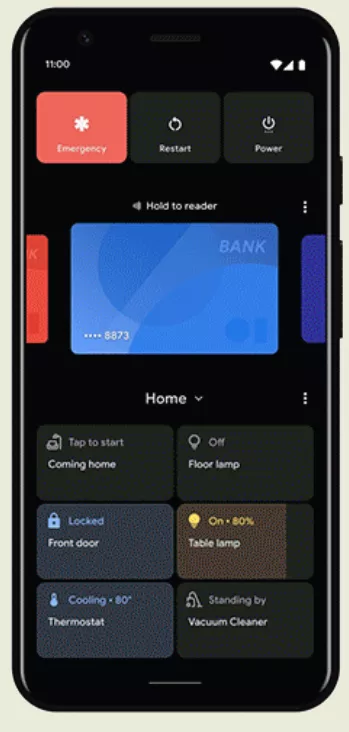 Google says this is like your phone's interface to the real physical world, which sure. This is where I think Google's attempt to manage complexity is starting to get a little strained. So for example, let's say you want to find the settings for this Power Menu. So you go to the settings app, which by itself seems like not too bad. I like that important controls like Wi-Fi or Bluetooth are right at the top. But anyway, where are the power controls? Well, they're under
 System > Gestures. Gestures? I mean, I know that they're there because Google put all of its custom controls underneath Gestures 'cause those used to be actual gestures for the way that you'd control custom Google things, but nobody else knows that. It's a button, it's not a gesture, what the heck?
But honestly, I'm not that angry about it. I mean, I will point out that if you wanna find something in settings, the easy thing to do is just go to the top and type in the thing you're searching for and it'll pop up. But I do wish that Google'd do this thing that Samsung does where at the bottom of some of its settings pages, it tells you that if you're looking for something else that you thought should be in that setting page, it's over in some other spot. Like I would always expect the Always On Display to be under the display settings, but it's not. It's actually under the lock screen and Samsung gets that that's confusing. And so they give you a little shortcut at the bottom.
But let's just assume you found your way somehow to the power settings. You get there and this is where you can toggle different parts of the Power Menu.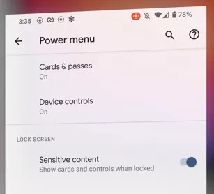 And even though I think that metaphor for what the Power Menu represents is weird, I love it. I do think it's super convenient to have access to these smart home controls so quickly. And I have found myself using this Power Menu all the time.
I'm not gonna go over every single feature in Android 11. I'm not gonna talk about how screen recording finally works, how screenshots look just like they do on the iPhone now, or, you know, actually this one's nice. Android is finally cracking down on apps that want background permission all of the time. Pretty much everything is getting moved to only have location permission when the app is open. And that's how it should be.
All in all, all the other features that I'm not getting to here, that's all pretty good stuff. At this point, I should really just call out the elephant in the room. We're mainly talking about Pixel phones here. Although this year, a couple others are getting it right away, which is great. Other Android phones are gonna get Android 11 at some point.
Speed on updates has gotten better over the last couple of years, but it's still not great. And even when the Android updates do come, it's hard to predict if everything is going to work the same. So for example, most Android phones still have the three buttons at the bottom, and some little swipey swipey controls that Google tried to get everybody to switch to a couple of versions ago.
Here's another example. That Power Button Menu, on most Samsung phones, long-pressing the power button now takes you to Bixby, but Google wants the power button to take you to that new Power Menu. So is Samsung gonna switch to that or not? And when they do, are they gonna use Google Home to power the smart home controls like the Pixel does, and Google Pay like the Pixel does? No, they're not. They're gonna wanna use SmartThings for home control and Samsung Pay for paying inside that menu.
And it's that kind of complexity that I don't know if Google knows how to manage. I'm not talking about the complexity within Android 11 itself. I'm talking about complexity across different versions of Android 11, Samsungs, and Microsofts, and LGs, and Googles, and whoever else. I'm starting to worry that we're gonna have to start saying the F word again. Fragmentation, that's the F word, but what word were you thinking?
Honestly, though, I really do hate ending every single Android review with a gripe about how only Pixels get it first, and everybody else is a little bit later. So I'm not kidding when I say that I think that update timing is getting better. It's never gonna be day and date as good as the way the iPhone does it, but we are a long ways from the battle days when you would wait six months to a year to never for Android updates. Plus companies like Samsung and OnePlus are committing to three years of updates and that really matters.
So that's my review of Android 11. It has a bunch of new features that are just barely contained into something that feels comprehensible. I do think it's a fine update, but you know what I want for Android 12? Well, I'll tell you what I want. I want Android to be better on foldables and tablets. Samsung and Microsoft are doing two totally different things. And Android is still messy on Chrome OS. You know, phones, I think they've got enough features to last us for a while. It is time to finally fix Android on the big screens, and also to do a better job helping developers navigate all of these new form factors that are coming, because Google, if you don't do that soon, whew, F word.
Let me know what you think of 'em down in the comments.

No comments yet